OUR NEW CASTLE HILL FITNESS LOGO
On Wednesday we wrote a post about the research we did in preparation for our new logo, as well as a loose timeline for our overall remodel. If you haven’t read it, check it out here.
We’re so excited to finally share this with you. So without further ado, we present our new logo!
![]()
A few design notes, in no order:
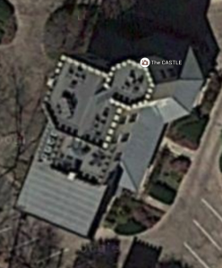
- The octagon shape of the C is inspired by the satellite view of the former Texas Military Institute, aka “the castle” above Baylor St.
- The navy blue is the cornerstone color. The other colors represent the many facets of who we are: Pilates, fitness, community, nutrition, wellness/spa, and yoga.
- The colors transition through the letters C, H and F (Acronym) at an angle, calling to mind forward motion and activity.

- The Acronym is created by repeating a parallelogram inside an octagon.

- The typeface has geometrical curves to complement the angular design of the Acronym.
Over the next few months, we’ll be updating all the elements of Castle Hill Fitness to have this new look. Please let us know what you think!